

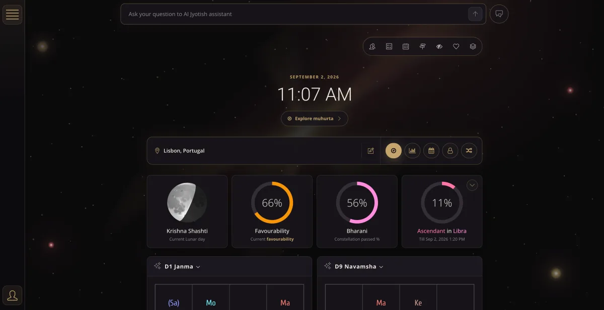
A month ago, we announced the beginning of a major new chapter for VedicTime — a deep redesign of the portal and its interface. We knew there was a lot of work ahead. But even we didn’t fully realize just how extensive this transformation would become. Today, that chapter is complete. ✨
Over the past month, we’ve gone through almost the entire VedicTime dashboard from the ground up: screen by screen, tool by tool, element by element. Some changes are immediately noticeable. Others are much smaller — a few pixels here, a better layout there, a clearer button, or simply removing something that didn’t need to be there. But it’s these details that ultimately shape the experience of using a product.
More Than Just a New Look
Our goal wasn’t simply to make VedicTime look better. Jyotish is a complex system. Birth charts, vargas, dashas, transits, Ashtakavarga, compatibility analysis, and many other tools inevitably involve large amounts of information. And it’s very easy for an astrology platform to become an “astrology machine” overloaded with features, tables, settings, and buttons — where functionality grows, but usability gets lost along the way.
We wanted something different. We want VedicTime to remain a powerful tool without making users struggle with the interface. Complex calculations should be easy to navigate. Important information should be easy to find. And working with Jyotish tools should simply feel good. In other words:
Complexity should stay inside the system — not be passed on to the user.
Almost Every Screen Has Been Revisited
Over the past month, the changes have touched nearly every part of the VedicTime dashboard. We redesigned calculation pages, cards, navigation, forms, and countless smaller interface elements. We worked on creating clearer visual hierarchy and making large amounts of astrological information easier to read and understand.
Special attention was given to the charts themselves. They are now more modern and interactive, making it easier to work with planets, houses, signs, and aspects. At the same time, we didn’t want to sacrifice VedicTime’s capabilities for the sake of a cleaner interface. The challenge was exactly the opposite: to preserve powerful functionality while making it more accessible, intuitive, and enjoyable to use.
🌙 VedicTime Now Has Dark Mode
Another major part of this update is a complete dark mode for the VedicTime dashboard. For us, this is more than simply changing the colors. Many users spend a significant amount of time working with astrological calculations — studying charts, comparing indicators, analyzing planetary periods, and returning to the same data again and again.
We wanted to create a calm and comfortable workspace that feels good to use both during the day and late into the evening. Now everyone can choose the version of VedicTime that feels right for them.
🚀 The Redesign Is Complete. The Development Isn’t.
After a month of intensive work, we can finally put a full stop at the end of this chapter: the major VedicTime redesign is complete. This is an important milestone for our team. The portal is now much closer to what we believe a modern Jyotish platform should be: powerful and technologically advanced, yet beautiful, clear, and comfortable to use.
But completing the redesign certainly doesn’t mean we’re done developing VedicTime. Quite the opposite.
Now that the new interface foundation is in place, we can once again focus on expanding what VedicTime can do. There’s much more ahead — new features, further development of our AI assistant, new tools, and new ideas that we’ll gradually share with you.
Thank you to everyone who uses VedicTime, shares feedback, and helps us make the platform better. ❤️
✨ The big update is complete. The next chapter of VedicTime is just beginning.


